Your Logo Has to Work Harder on a Shirt
A logo that looks sharp on a business card or website header does not automatically look great on a t-shirt. Apparel is a fundamentally different canvas. The substrate stretches, folds, and wrinkles. The decoration methods have physical limitations that screens and paper do not. And the viewing distance is measured in feet, not inches.
The good news is that logos designed with apparel in mind tend to look better everywhere else too. Clean, bold, versatile logos are timeless for a reason. This guide covers what you need to know to design a logo that translates beautifully to custom apparel, or adapt an existing logo to work across print methods.
What File Format Should You Use for a Logo on Apparel?
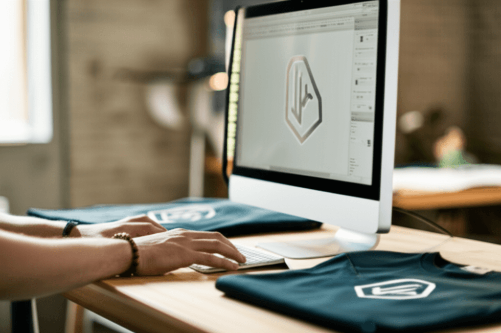
The file you hand to your printer determines the ceiling of your print quality. Here is what to provide, ranked from best to acceptable.
Vector Files (Best)
- Formats: AI (Adobe Illustrator), EPS, SVG, PDF (vector-based)
- Why: Vector files are built from mathematical paths, not pixels. They scale to any size with zero quality loss. Your printer can separate colors cleanly, resize without distortion, and output exactly what you designed.
- Rule of thumb: If your logo was professionally designed, you should have vector source files. If you do not, ask your designer or check your brand asset folder.
High-Resolution Raster Files (Acceptable)
- Formats: PNG (preferred for transparency), TIFF, PSD
- Resolution: Minimum 300 DPI at the actual print size. For a 12-inch wide back print, that means at least 3600 pixels wide.
- Why: Raster files work when vector is unavailable, but your printer may need to recreate or trace the artwork for certain methods (especially screen printing and embroidery).
What to Avoid
- Low-resolution JPEGs: Compression artifacts create fuzzy edges and color banding. A 200-pixel-wide logo pulled from your website footer will not produce a quality print at any size.
- Word documents or PowerPoint slides: These are not design files. The logo embedded in them is almost always low-resolution and color-shifted.
- Screenshots: Never. A screenshot of your logo introduces compression, color inaccuracy, and resolution limitations all at once.
What Is High-Resolution Apparel Branding?
High-resolution apparel branding means supplying and sizing your logo so it reproduces crisply on garments at the actual print size, across every decoration method you plan to use. In practice it is a short checklist: a vector master file (AI, EPS, SVG, or vector PDF) that scales to a full back print without losing an edge; a raster export at 300 DPI at print size for any method that needs pixels (a 12-inch print needs at least 3,600 pixels across); a one-color version and a reversed (white) version for dark garments; a simplified embroidery version with no hairlines or tiny text; and Pantone callouts for every brand color. Brands that keep these assets together in one apparel kit get consistent results whether the logo is screen printed on a tee, embroidered on a polo, or heat-pressed on a jacket, and they never pay to have the logo recreated. If all you have is a low-resolution web logo, our art department can redraw it as a vector once and keep it on file; see How to Prepare Your Artwork for Screen Printing.
How Does the Print Method Change Your Logo Design?
Each printing and embroidery method handles artwork differently. A logo optimized for screen printing may need adjustments for embroidery, and vice versa.
Screen Printing
Screen printing uses one screen per ink color. Each color is a separate pass through the press. This means:
- Fewer colors = lower cost. A 1 to 3 color logo is ideal for screen printing economics.
- Spot colors work best. Solid blocks of color reproduce cleanly. Pantone (PMS) matching ensures brand accuracy.
- Gradients are possible but require halftone dots or simulated process techniques, which add complexity and cost.
- Fine lines must be at least 1 point thick (about 0.35 mm) to hold ink consistently.
- Knockouts and trapping matter. Where two colors meet, your printer needs slight overlaps (trapping) to prevent gaps caused by minor registration shifts.
DTG and DTF Printing
Digital methods handle complexity with ease:
- Full color, gradients, photographs, and unlimited colors at no extra cost
- Fine detail reproduces well
- No color separation needed
- Ideal for logos with photographic elements, complex gradients, or many colors
Embroidery
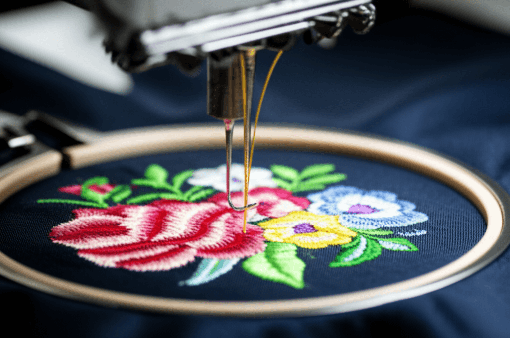
Embroidery has the most constraints:
- Minimum detail size: Text should be at least 5 mm tall. Fine lines thinner than about 1 mm will not stitch cleanly.
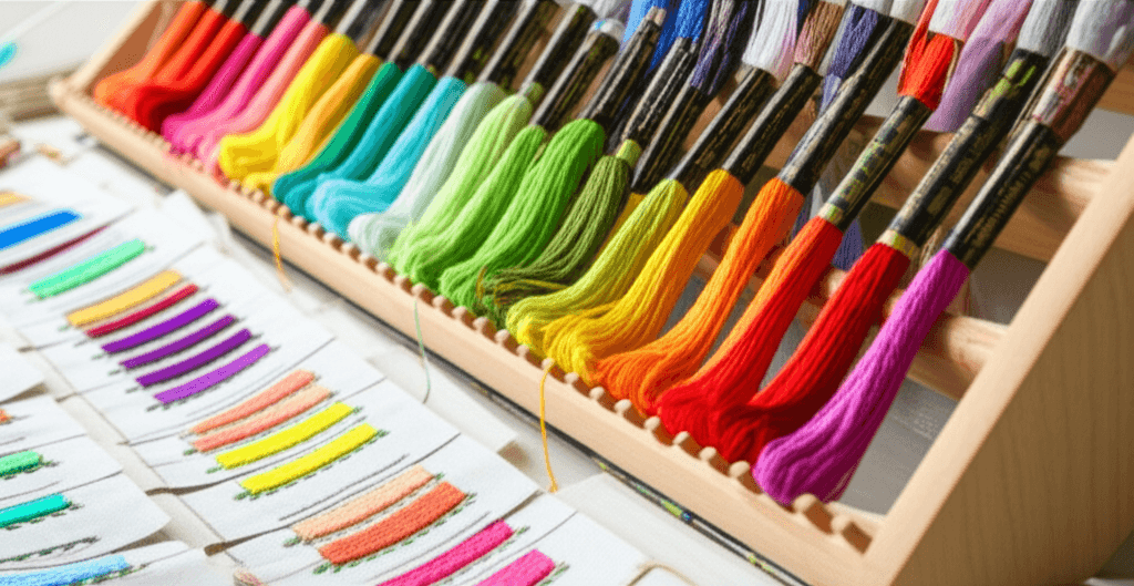
- Color changes add cost. Each thread color is a manual change on the machine.
- Gradients do not work. Embroidery uses solid thread colors. Smooth transitions are not possible.
- Simplify your logo for embroidery. Many brands maintain a separate "embroidery version" with reduced detail.
What Size Should a Logo Be on a Shirt?
Where you place your logo and how large you make it significantly affects the final look.
Standard Placement Options
- Left chest: 3.5 to 4 inches wide. The most common and professional placement for business and team apparel. Sits over the heart, about 7 to 9 inches from the shoulder seam and 4 to 5 inches from center.
- Full front center: 10 to 12 inches wide. Bold statement placement for event tees, promotional shirts, and streetwear.
- Full back: 10 to 14 inches wide. Great for names, numbers, large graphics, and sponsor logos.
- Sleeve: 3 to 4 inches wide. Popular for secondary logos, flags, or sponsor placements.
- Nape (back of neck): 2 to 3 inches wide. Clean placement for brand marks, often used in combination with a front design.
Sizing Tips
- View your design at actual print size before approving. What looks bold at 4 inches on a computer screen may look tiny on an actual XL tee.
- Scale proportionally across garment sizes. A left-chest logo that looks perfect on a Medium may appear small on a 3XL. Discuss scaling with your printer.
- Leave margins. Do not push designs too close to seams, collars, or hems. Allow at least 1 to 2 inches of clearance from any garment edge.
Why Does a Logo Look Different on a Hoodie vs a T-Shirt?
Three things change between a tee and a hoodie: the fabric surface, the garment color, and the scale. Fleece has a looser, fuzzier face than jersey cotton, so fine lines soften and small text fills in; that is why the same left-chest logo often needs a heavier line weight or a slightly larger size on a hoodie, and why embroidery on fleece is digitized with more underlay. Hoodies are bought in darker colors more often, which means a white underbase or a reversed logo version. And a hoodie is physically bigger, with a pocket and a zipper to avoid, so a 3.5-inch chest logo that fills a tee can look undersized on a 2XL hoodie and a full-front design has to stay above the kangaroo pocket. Ask for a mockup on each garment type rather than assuming the tee proof carries over.
Which Shirt Colors Make Your Logo Most Visible?
Color decisions affect cost, appearance, and versatility.
Work With the Blank Color
The garment itself is a color in your design. A white logo on a navy tee is a two-element design using only one ink color. Smart designers choose blank colors that complement their logo and reduce the number of inks needed.
Limit Your Palette
- 1 to 2 colors is the sweet spot for cost-effective screen printing
- 3 to 4 colors adds visual interest but increases cost per piece
- Full color is available through digital methods (DTG, DTF) with no per-color cost
- Embroidery cost goes up with each thread color change
Test on Multiple Blank Colors
Your logo needs to work on light and dark backgrounds. Many logos need both a full-color version and a single-color version (white for dark shirts, dark for light shirts). If your logo only looks good on white, you are limiting half your wardrobe options.
Specify Colors Precisely
Do not say "blue." Specify Pantone 2945 C. Precise color callouts ensure the navy on your shirts matches the navy on your business cards, your website, and your signage. Your printer can match PMS colors in screen printing ink and embroidery thread.
What Software Should You Use to Design a Logo for Apparel?
Any vector program that exports AI, EPS, SVG, or PDF will do. Adobe Illustrator is the industry standard and what most print shops open natively; Affinity Designer and CorelDRAW are full vector tools at a lower cost; Inkscape is free and exports clean SVG. Canva can work for simple logos if you export as SVG (Pro) or a high-resolution PNG with a transparent background, but avoid screenshotting the canvas. Photoshop and Procreate are raster tools: fine for artwork that will print DTG or DTF, but a logo drawn there will need to be vectorized before it can be screen printed or embroidered cleanly. Whatever you use, set the document to the real print size, convert text to outlines before exporting, and keep an editable master file.
Common Mistakes to Avoid
Designing for Paper, Not Fabric
A logo with hairline details, 8-point type, and subtle gradients will not survive the translation to thread or ink on fabric. Always consider the physical medium.
Ignoring the Garment Color
A beautiful full-color logo designed on a white artboard may look completely different on a heather gray or black shirt. Always mock up your design on the actual blank color you plan to use.
Skipping the Proof
Every reputable printer provides a digital proof or mockup before production. Review it carefully. Check placement, size, colors, and spelling. This is your last chance to catch issues before hundreds of pieces are produced.
Using Too Many Fonts
Stick to one or two typefaces maximum. On apparel, especially at small sizes like left-chest, type needs to be clean and legible. Decorative or script fonts can become illegible at smaller print sizes.
Forgetting About Wearability
The best apparel designs are ones people actually want to wear. A shirt plastered with a massive logo, phone number, website URL, address, and tagline is a billboard, not wearable apparel. Keep it clean. Let the logo speak for itself.
Put Your Logo on Apparel
A great logo on the right blank, decorated with the right method, at the right size and placement, is one of the most powerful branding tools any business can have. Take the time to get your files right and your design optimized, and the results will speak for themselves.
French Press Custom helps businesses, brands, and organizations bring their logos to life on custom apparel every day. Whether you need screen printing, embroidery, DTG, or DTF, our art department will review your files, recommend the best approach, and ensure your logo looks its absolute best.
Get a free quote or call (562) 407-3800 to get started. See our screen printing, embroidery, and DTG services for what each method needs from your files.