The Ultimate Guide to Pantone Color Matching
Color consistency is one of the biggest challenges in custom apparel printing. Your logo looks one shade of blue on your website, another on your business card, and something else entirely on your custom shirts. The solution? Pantone Matching System (PMS) colors.
At French Press Custom, we mix every screen printing ink to exact Pantone specifications. Here is everything you need to know about getting your colors right.
What Is the Pantone Matching System?
The Pantone Matching System (PMS) is a standardized color identification system used worldwide. Each color has a unique number (like PMS 186 C for Coca-Cola Red or PMS 294 C for Facebook Blue) that ensures the same color is reproduced identically regardless of where or how it is printed.
Why Pantone Matters
- Consistency — PMS 286 C looks the same whether printed in Los Angeles or Tokyo
- Communication — telling your printer "blue" means nothing. PMS 2728 C means exactly one shade
- Brand integrity — your logo should look identical across shirts, business cards, signage, and packaging
- Repeatability — reorders match previous orders perfectly
How Pantone Colors Work in Screen Printing
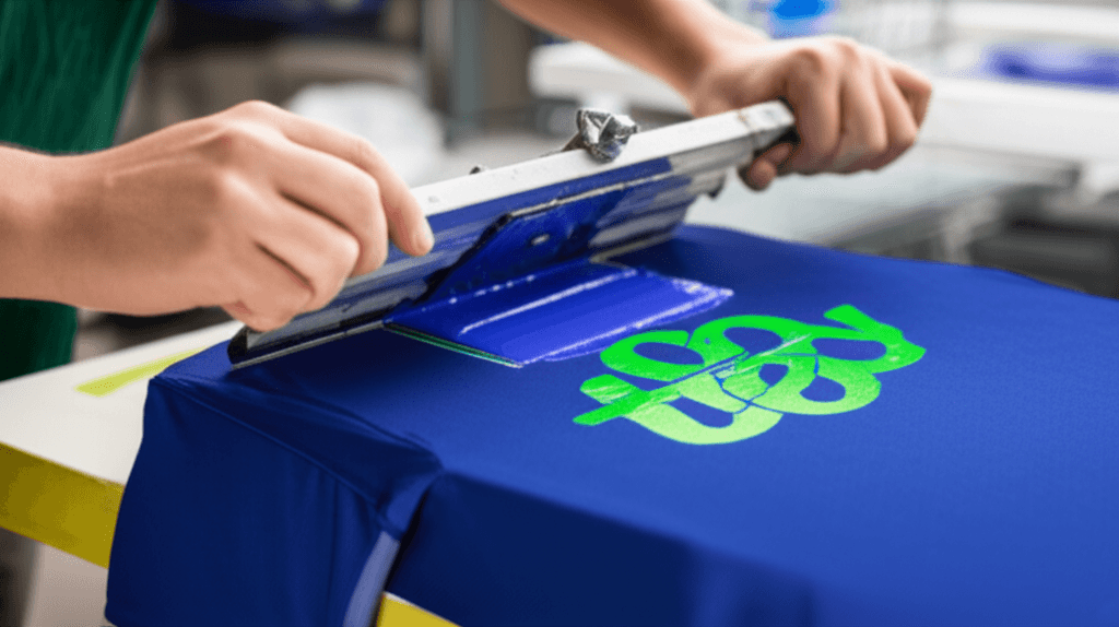
Screen printing uses spot colors — each color is a separate, pre-mixed ink applied through its own screen. This is fundamentally different from digital printing (CMYK), which builds colors from tiny dots of four inks.
The Process
- You provide your Pantone color numbers
- We mix ink to match that exact Pantone formula
- The mixed ink is applied as a single, solid color
- The result is a rich, opaque, exact color match
This is why screen printing delivers more vibrant, accurate color than CMYK digital printing — each color is a pure, solid ink rather than an optical illusion created by overlapping dots.
How to Find Your Pantone Colors
If You Have Brand Guidelines
Most established brands have a style guide that lists their official Pantone colors. Check with your marketing department or look for a "brand guidelines" PDF.
If You Have a Logo File
- Open your logo in Adobe Illustrator
- Click on the colored elements
- Check the swatch panel — properly prepared logos use Pantone swatches
- If the swatches say CMYK or RGB, the colors need to be converted
If You Only Have a Website Color (Hex Code)
Hex codes (#FF5733) are for screens. They do not translate perfectly to ink on fabric. However, we can find the closest Pantone match:
- Use the Pantone Color Finder tool at pantone.com
- Enter your hex code and it will suggest the closest PMS color
- Be aware: the match will be approximate, not exact
If You Have a Physical Sample
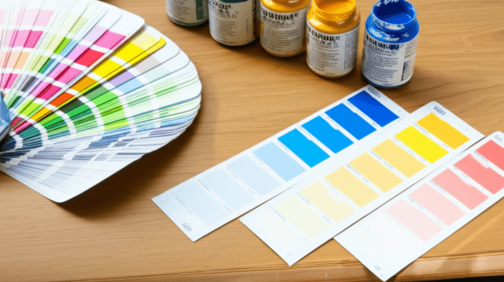
Bring or mail us a physical sample of the color you want to match (a business card, a previous shirt, a paint chip). We will visually match it to the closest Pantone swatch using our physical Pantone guide.
Pantone Coated vs Uncoated
Pantone colors come in two versions:
- Coated (C) — for glossy, smooth surfaces (PMS 286 C)
- Uncoated (U) — for matte, porous surfaces (PMS 286 U)
For fabric printing, we primarily reference Coated (C) Pantone colors, though fabric ink has its own absorption characteristics. The key point: always specify which version you are referencing.
Color Matching Expectations
What We Can Match Perfectly
- Solid Pantone colors mixed to PMS formula
- Consistent color across an entire order
- Color matching between reorders (same ink formula every time)
What Affects Color Accuracy
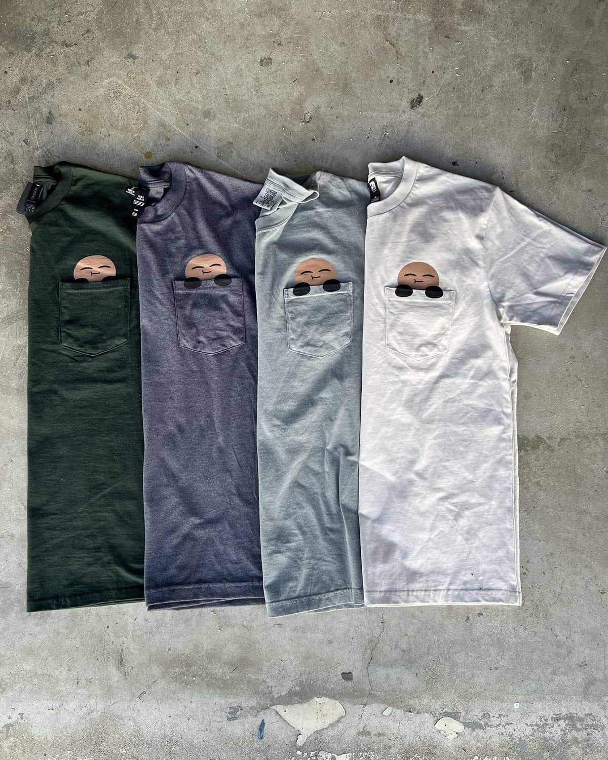
- Garment color — the same ink looks different on white vs heather gray vs navy
- Fabric type — cotton absorbs ink differently than polyester
- Ink type — plastisol vs water-based vs discharge each render color slightly differently
- Underbase — on dark garments, a white underbase affects the final color
Important Disclaimers
- Colors on your computer screen will not match printed ink perfectly. Screens use RGB light; ink is physical pigment
- Fabric is not paper — ink on cotton looks different than ink on a Pantone chip
- A 5-10% color variance is considered acceptable in the textile printing industry
Common Color Matching Mistakes
1. Providing RGB or CMYK Values Instead of Pantone
RGB (255, 87, 51) and CMYK (0, 66, 80, 0) are for screens and offset printing. They do not translate directly to screen printing ink. Always provide PMS numbers.
2. Expecting a Screen-Accurate Match
Your monitor displays millions of colors using light. Screen printing ink is opaque pigment on fabric. There will always be some difference between what you see on screen and the final printed product.
3. Not Specifying the Garment Color
PMS 186 C looks vibrant on a white tee and muddy on a charcoal tee. When requesting a color match, always tell us the garment color so we can advise on the final appearance.
4. Matching to a Faded Reference
If your reference sample is a 3-year-old t-shirt that has been washed 200 times, the colors have shifted. Try to provide an unwashed or original sample.
Pantone Color Tips for Common Uses
Corporate Branding
- Get your brand Pantone colors documented in a style guide
- Use the same PMS numbers for all printed materials (shirts, brochures, signage)
- Order a physical Pantone proof before approving large corporate runs
School Colors
- Most schools have official Pantone colors on file
- Contact your school's administration or marketing department
- Common school colors: PMS 186 (red), PMS 280 (navy), PMS 349 (forest green)
Sports Teams
- Pro teams and NCAA programs have documented color standards
- Reference official team brand guides for exact PMS numbers
- Knock-off colors (close but not exact) can look off to fans who know the real thing
Getting It Right at French Press Custom
We take color accuracy seriously. Here is our process:
- You provide Pantone numbers (or we help you identify them)
- We mix a custom ink batch using the Pantone formula
- We print a test pull on the actual garment you selected
- We send you a photo for approval (or a physical sample for large orders)
- We match that formula on every reorder, forever
For brand-critical orders, we offer printed color proofs on fabric shipped to you before production begins. This costs $25-50 but ensures zero surprises.
Call us at (562) 407-3800 or include your Pantone numbers in your quote request for an accurate estimate.
Frequently Asked Questions
What is the Pantone Matching System?
PMS is a standardized color identification system used worldwide, where each color carries a unique number so the same shade is reproduced identically no matter where it is printed. Telling a printer "blue" means nothing; PMS 2728 C means exactly one shade.
What if I only have a hex code for my brand color?
Hex codes are built for screens and do not translate perfectly to ink on fabric. The Pantone Color Finder at pantone.com will suggest the closest PMS color from your hex value, but treat that result as approximate rather than exact.
Will my printed shirt match what I see on my monitor?
No. Monitors display color using light while screen printing ink is opaque pigment on fabric, so there will always be some difference. A 5 to 10 percent color variance is considered acceptable in the textile printing industry.
Does the garment color change how my Pantone ink looks?
Yes. The same ink reads differently on white, heather gray and navy, and on dark garments a white underbase affects the final color. Always tell us the garment color when you request a match so we can advise on the final appearance.